Ease
The project's objective was to develop a smartphone music app, and I had a five-week timeframe for its completion. The result is Ease, a music app crafted to provide effortless music discovery and listening experiences.
Research
I initiated my research process by conducting a comprehensive competitor analysis. In this analysis, I closely examined several prominent music apps, including well-known platforms such as Spotify, Amazon Music, Apple Music, and YouTube Music. The objective was to gain a thorough understanding of their functionalities, user interfaces, and the overall user experience they offer to their audiences. This investigative approach provided valuable insights into the strengths and weaknesses of these music applications, ultimately informing my design decisions for the project ahead.
Idea Generation
My journey started with a mind map, where I brainstormed ideas, considered the target audience, UI design, and colour scheme. My goal was clear: design a music discovery app that would make finding songs a quick and effortless experience. Users should be able to search using keywords, lyrics, or even hum into their devices. I envisioned merging features from Shazam, lyric recognition, and audio recognition into a single app.
Process
I initially sketched out ideas but felt limited by a fixed design style. I transitioned to a more fluid, sketchy approach, creating thumbnail-style wireframes. These sketches laid the foundation for a simplified and accessible layout. The introduction of new features required the design of numerous icons.
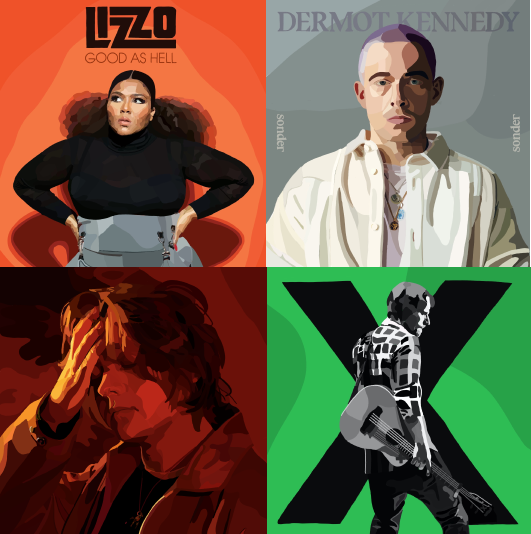
I crafted abstract-style illustrations in various colours to convey different moods, creating a visually appealing aspect of the app. While my initial plan was to use these as album art and playlist covers, I opted for a more illustrative approach that integrated original album art with an illustrative twist.
I chose the name "Ease" to reflect the effortless nature of music discovery, making the process of finding music quick and straightforward. The coral and grey colour scheme struck a balance between energetic and calm, passionate and composed, and added a distinctive brand identity to EASE.
Branding
UI and Brand Application
The final screens showcase the journey from concept to a fully refined music discovery platform. These screens were prototyped in Figma, including the app's interactions. The EASE project demonstrates the evolution of an idea into a visually appealing and user-friendly music discovery platform, reflecting the creative process and design choices that brought it to life.
Reflection
The journey of crafting EASE, the music discovery app, has been a fulfilling one. From the initial concept to the final high-fidelity screens, I've outlined the steps involved in creating a user-friendly platform. This case study underscores the importance of user-centric design and creative innovation in app development. It serves as an insightful guide for designers and enthusiasts looking to embark on a similar journey.
Want to read more?
Check out my Notion blog for a full breakdown of this project


